Overview
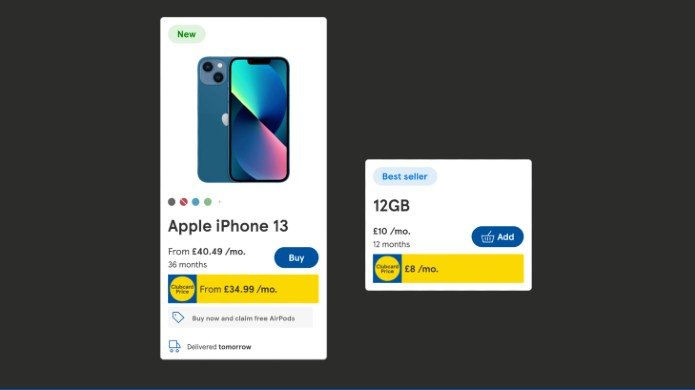
This case study explores the redesign of Tesco Mobile's product cards, aiming to create a more cohesive, user-friendly, and visually appealing component for displaying mobile phones, SIM deals, and accessories. The project focused on delivering a snapshot of essential information for customers, improving decision-making while maintaining flexibility for different product types.

Discovery
User Research
To understand user needs, we conducted a series of usability tests with 40 participants who interacted with various product cards across competitors and Tesco's own digital platforms.
Key findings included:
-
Users typically focus on product name, price, and any highlighted offers such as Clubcard Prices.
-
Many users prefer quick, clear comparisons between products without being overwhelmed by excessive details.
-
There was strong interest in visual elements, such as color swatches and delivery information, with users actively trying to interact with these elements (e.g., clicking on swatches to change product colors).
-
Some users expressed confusion about contract terms and expected to see more details, such as the data allowance or contract length.
Competitor Analysis
We analysed the product cards of competitors (Google, Apple, Currys, and Sky Mobile), identifying strengths and areas for improvement:
-
Google: Clear product name and price, clickable colour swatches, and simple CTAs, but lacked contract details.
-
Apple: Prominent pricing and payment options, with colour swatches and a simple CTA, but no indication of contract length.
-
Currys: Information overload, with a focus on price, but inconsistent spacing and multiple product cards for variants.
-
Sky Mobile: Simple design but lacked key details like colour availability and had small images on mobile devices.
Key Opportunities:
-
Clear, consistent product presentation with minimal clutter.
-
Consider clickable colour swatches and integrate more contract-specific information (e.g., contract length, data allowance).
-
Provide simple, actionable CTAs without overwhelming users.
Problem statement
"I’m looking to buy a new phone or SIM deal. When browsing, I want to quickly assess the product details so I can make an informed decision without feeling overwhelmed by too much information."
Hypothesis
We believe that a streamlined, dynamic product card design — tailored to showcase essential information — can help users make quicker purchase decisions, reduce cognitive load, and enhance the overall browsing experience, leading to higher engagement and conversion rates.
Solution Design
Building the Product Card
-
The new product card design focuses on displaying the most important information upfront:
-
Product Name & Price: Clear and prominent.
-
Clubcard Prices: Highlighted for Clubcard members.
-
Color Availability: Clickable color swatches for better interactivity.
-
Contract Length: Displayed clearly for products with contracts.
-
Primary CTA: A simple "Add to Basket" button with a less aggressive copy to avoid premature decisions.
-
Delivery Information: Clearly displayed for users interested in delivery timelines.
Card Adaptability
The design allows for adaptability based on the product type:
-
Pay Monthly Handsets: Emphasis on pricing and contract details.
-
Pay As You Go Handsets: Focus on one-time payment.
-
Pay Monthly SIM: Highlight data allowance and contract duration.
Designing with Accessibility in Mind
Ensuring accessibility was a critical aspect of the redesign, ensuring the product cards were usable for a wide range of customers, including those with visual impairments or cognitive challenges.
Key accessibility considerations included:
-
Colour Contrast: High contrast between text and background to improve readability for users with low vision or colour blindness. We used dark text on a light background for better contrast.
-
Font Size and Scalability: Ensuring that text size is adjustable and that all elements scale properly across different screen sizes and devices.
-
Keyboard Navigation: We ensured that all interactive elements, such as buttons were accessible via keyboard navigation for users with motor impairments.
-
Screen Reader Compatibility: Product card elements were marked up to ensure compatibility with screen readers, helping visually impaired users navigate the page.
-
Clear Labelling: Labels like “Add” “Refurbished” and delivery info were explicitly labeled to aid both visual and screen reader users in understanding the purpose of each element.


Usability Testing
Objectives
To evaluate the effectiveness of the redesigned product card and identify any unmet user expectations.
Methodology
-
10 participants, aged 25-70, interacted with the product cards on a mobile device.
-
Participants were asked to complete tasks such as browsing, identifying key details, and making a decision to add an item to the basket.
Findings
-
All users easily identified the product name, price, and Clubcard Price.
-
The 'New' label and color swatches were well understood and helped users engage with the products.
-
The delivery message received positive feedback for being clear and informative.
-
Some users hesitated to click the "Buy" button, preferring to explore other options before committing.
-
A few users suggested emphasising the AirPods promotion and displaying more details about the data allowance within the pricing.
-
Several participants expected to click on colour swatches to change the product visual, indicating a desire for more interactivity.
Key Insights
-
Product name and price were the most important elements for users when scrolling through the page.
-
The CTA could be softened to avoid rushing users into a decision.
-
Users would appreciate more transparency around what is included in the pricing, particularly regarding data allowances.
-
Promotions should be more prominent, especially for bundled offers or limited-time discounts.
Recommendations
-
Include accurate collection timeframes (e.g., “Ready to collect within 2 hours”).
-
Provide Click & Collect details in all customer communications (email/SMS).
-
Ensure store opening hours are accessible during the selection process.
-
Integrate the in-store collection experience with the online journey for consistency.